Exterior
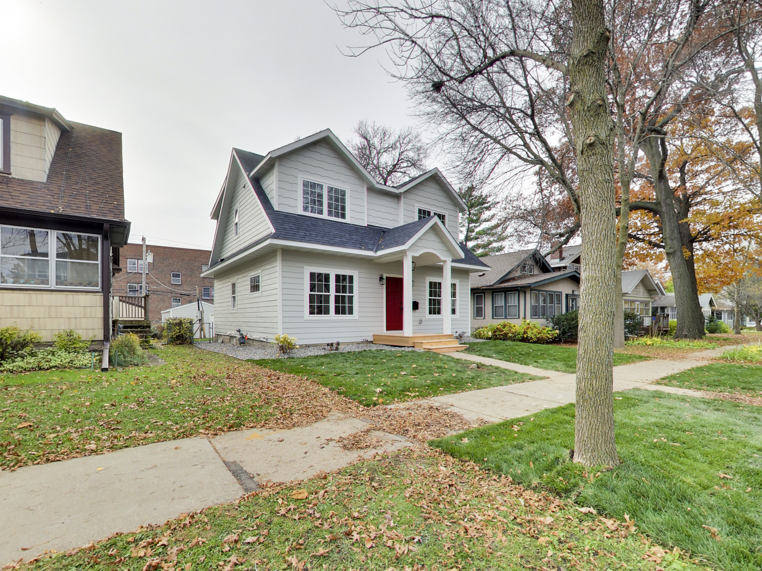
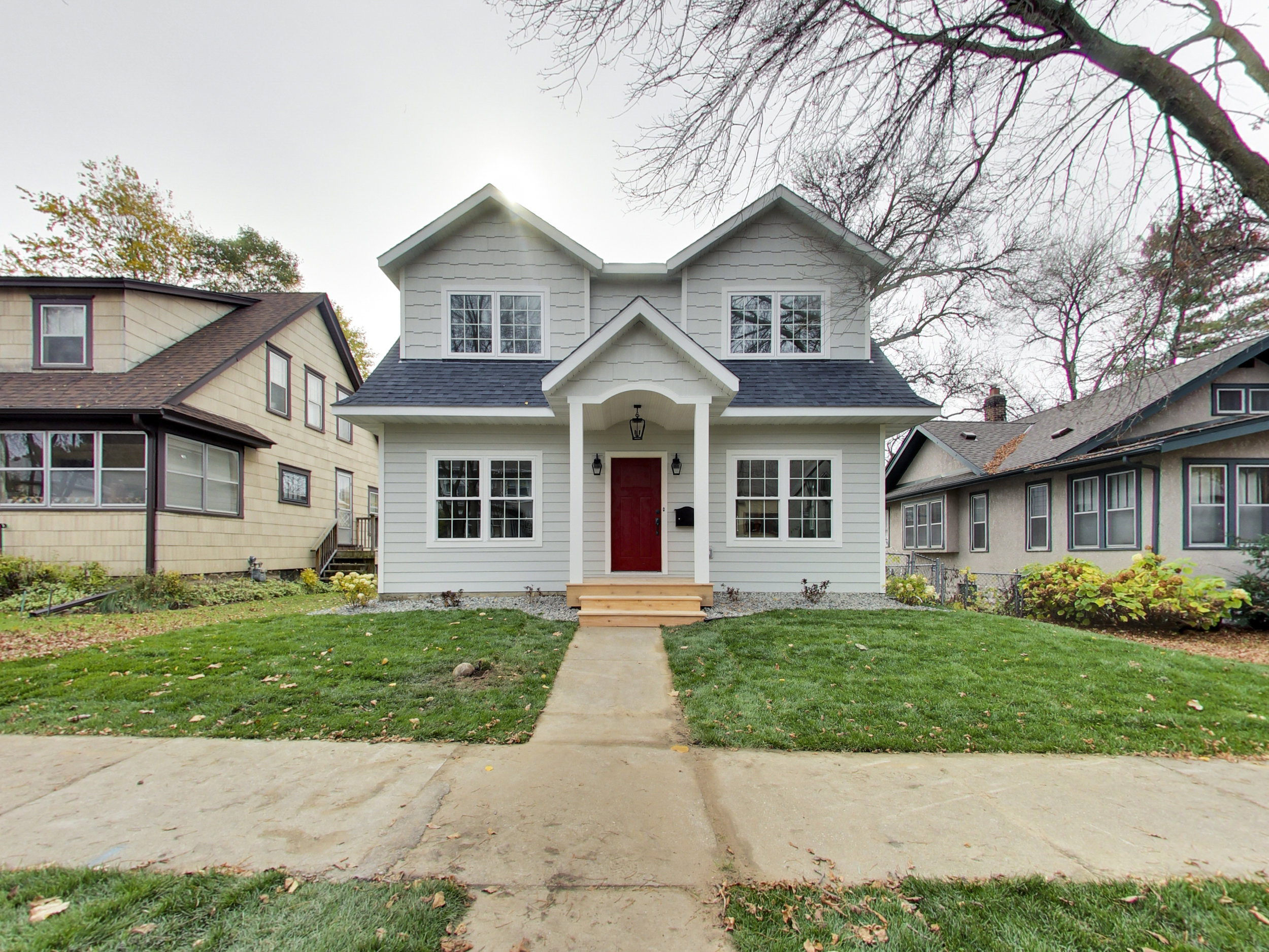
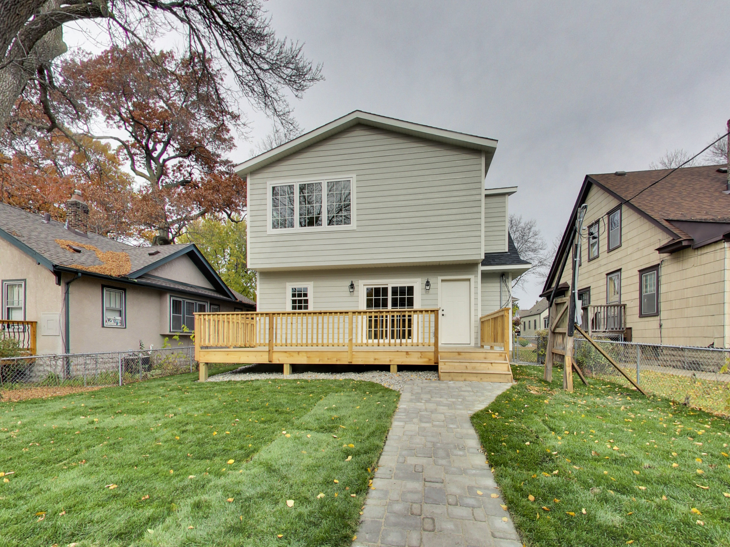
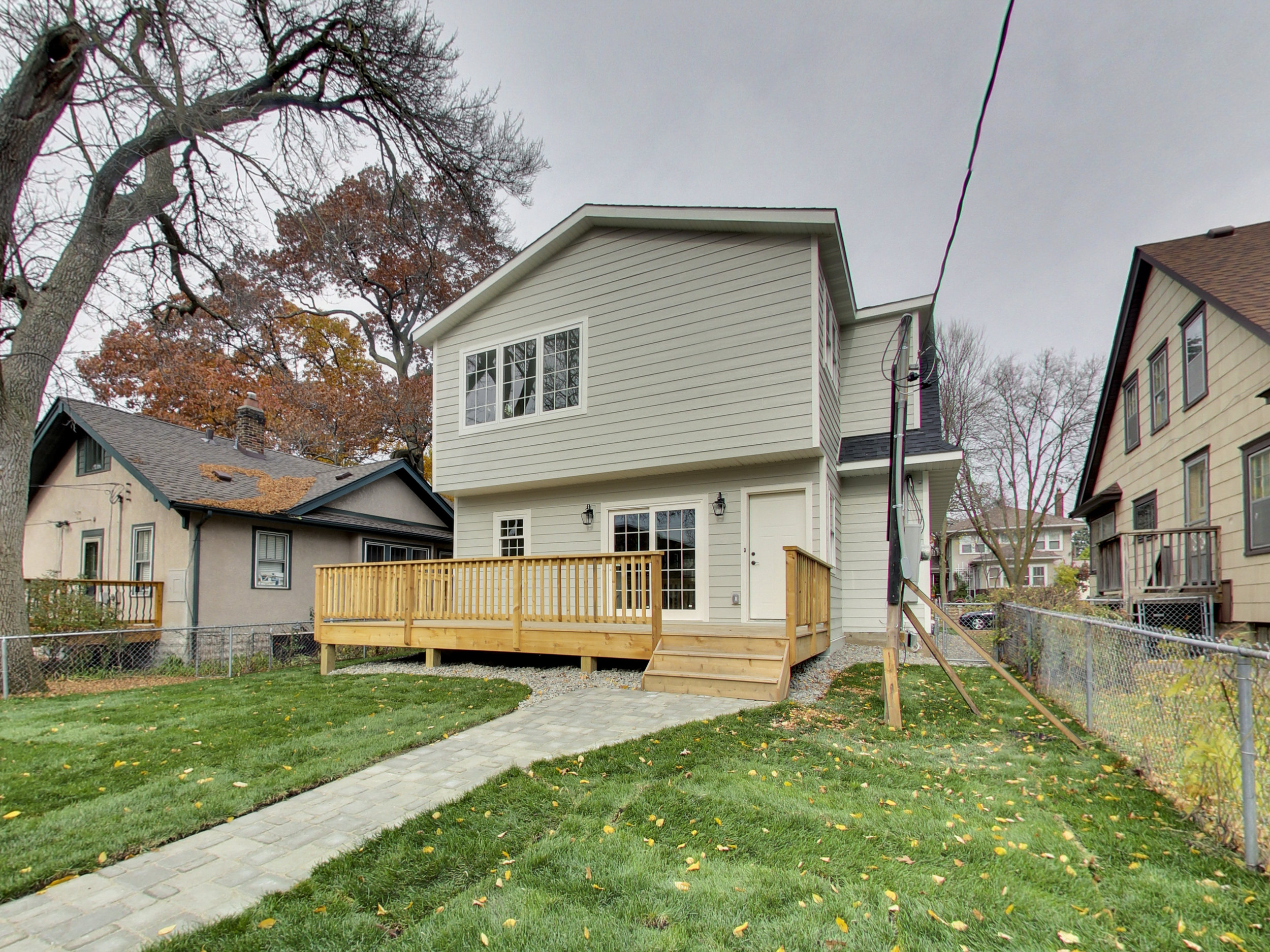
We focused on keeping a simple, symmetrical, look to reflect the original cape cod style of the home. We selected materials that were high quality and a color scheme that was classic, light and bright. Simple landscaping was used to highlight the symmetry of the house and add charm without adding lots of extra maintenance to the home. The best feature though, that red front door!



Affiliate Disclosure: As an Amazon Associate I earn from qualifying purchases. You should assume the owner of this website has an affiliate relationship and/or another material connection, to any suppliers of goods and services that may be discussed here and may be compensated for showing advertisements or recommending products or services, or linking to the supplier's website.
sconces
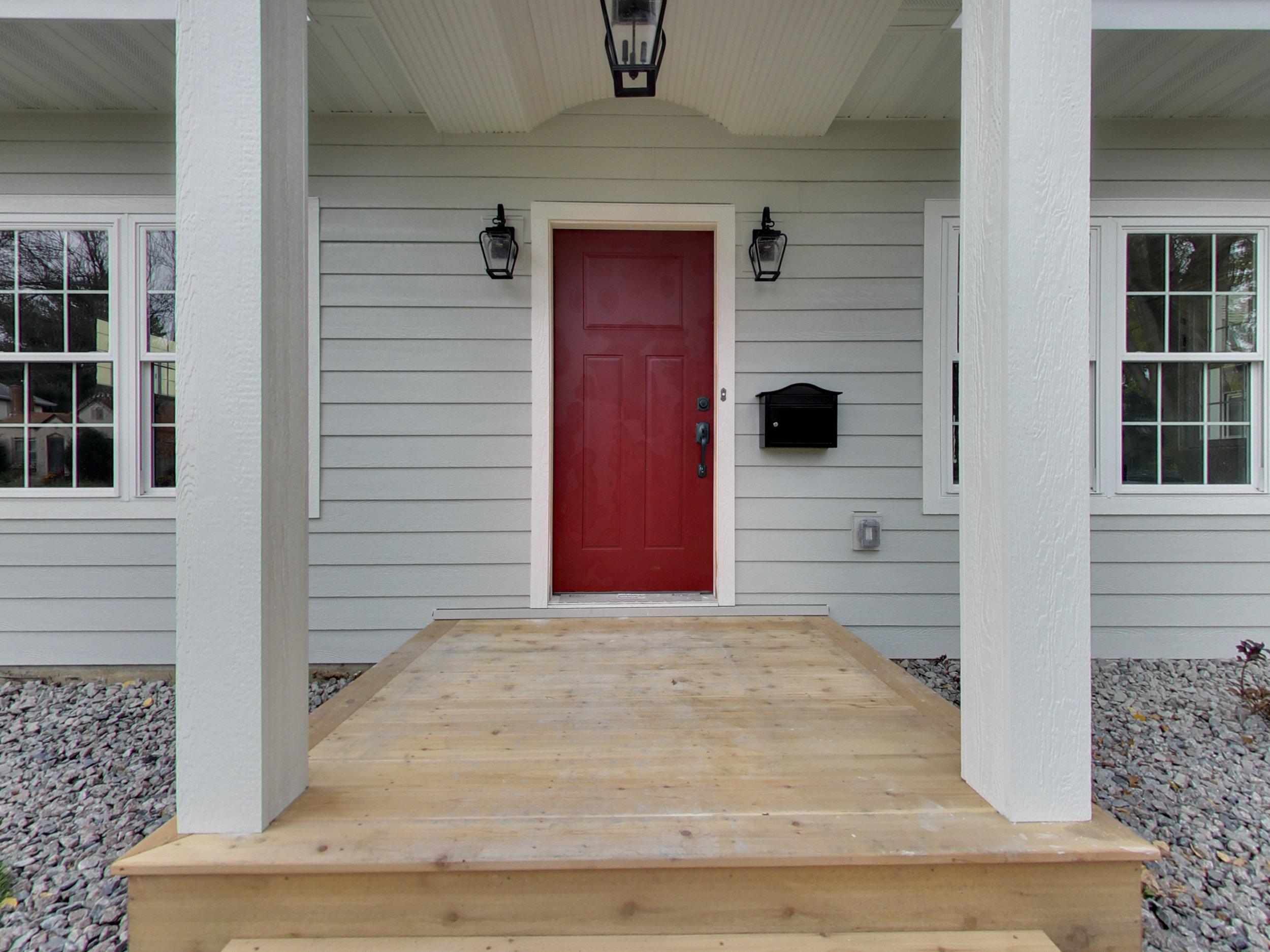
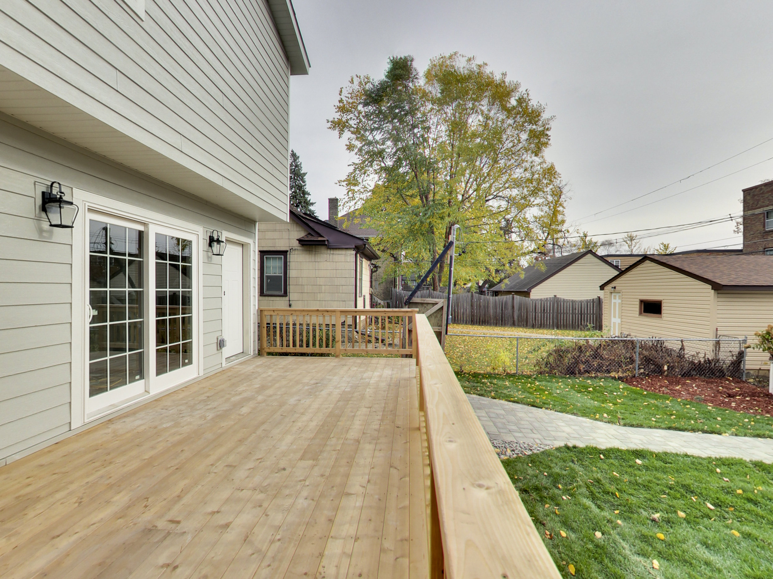
We loved the shape of these lights! Updated look with classic seed glass.
hanging light
A hanging light brightened up the exterior and added more flair to the front entryway. This light in a matching style to the wall light with seed glass is exactly what we needed!
Mailbox
An arch top wall-mounted mailbox was the perfect style to match this home. What made it even better was that the mailbox was locking to ensure the mail stayed safe!
Siding
We selected LP SmartSide lap siding and trim. We love the quality and look of the material for this home.
Decking
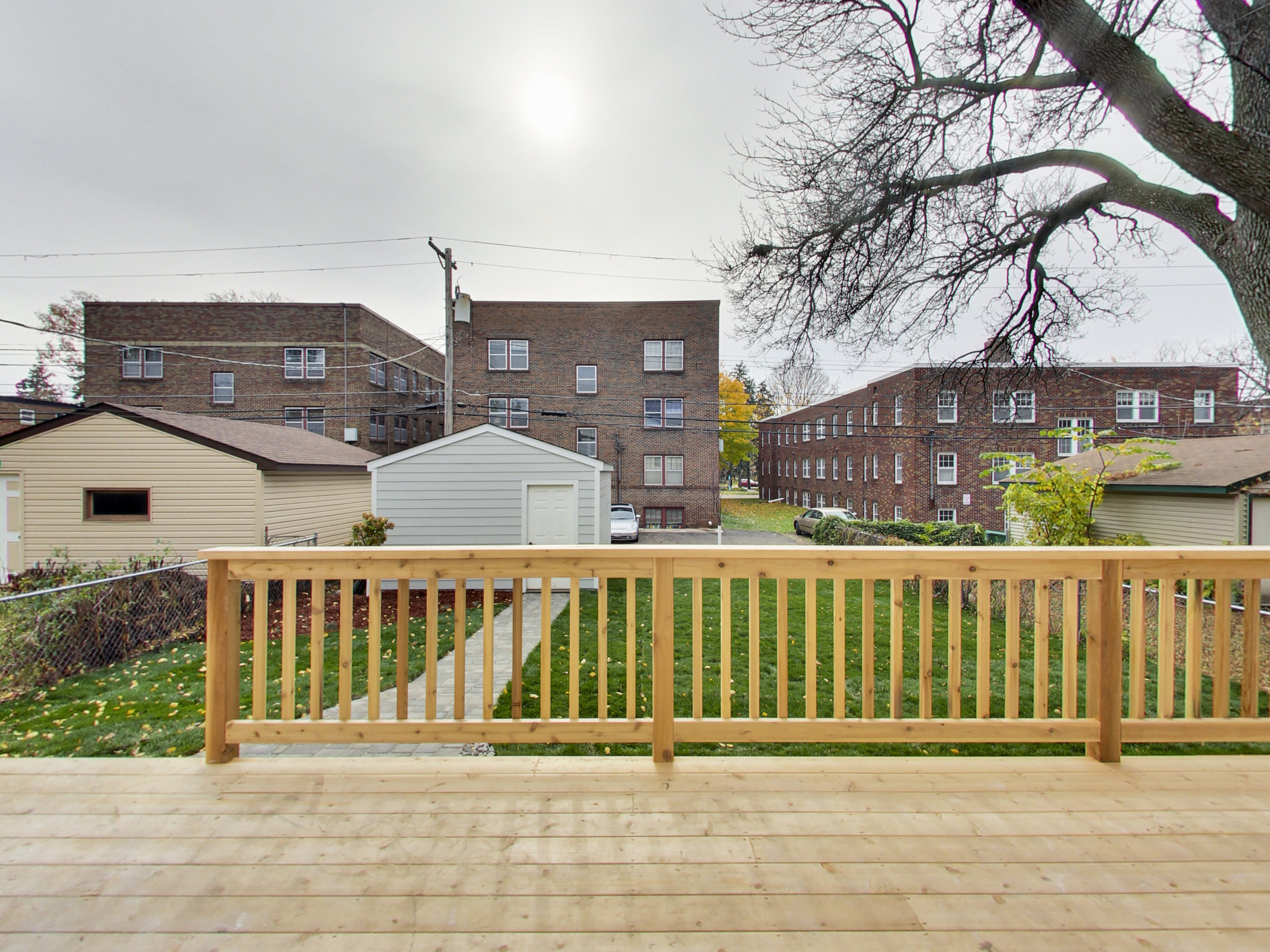
We chose cedar decking for the front and back decks. We love cedar decking for a whole bunch of reasons- if you want to figure out what the best decking material might be for you, check out this article.
Pavers
We chose concrete paving stones in a charcoal color for the front and back sidewalks of the home.
roof
We wanted a big contrast (and the snow to melt off easily) so we chose the darkest color shingles we could.
*Items listed on the individual room pages are examples and not necessarily the exact items used in this remodel.
